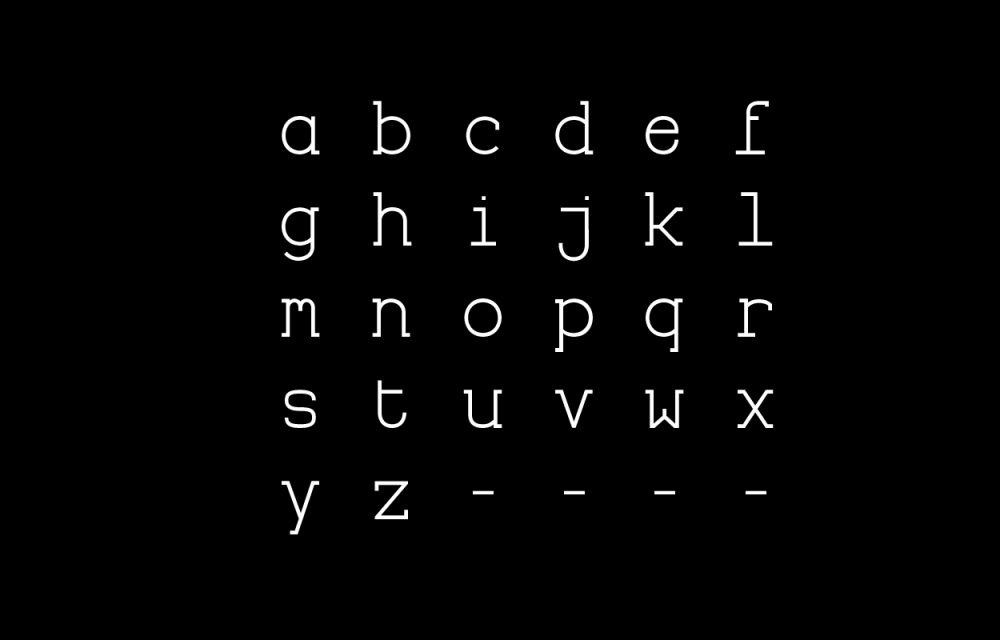
Slabouch


Designed by Matěj Kašpar Jirásek in 2015
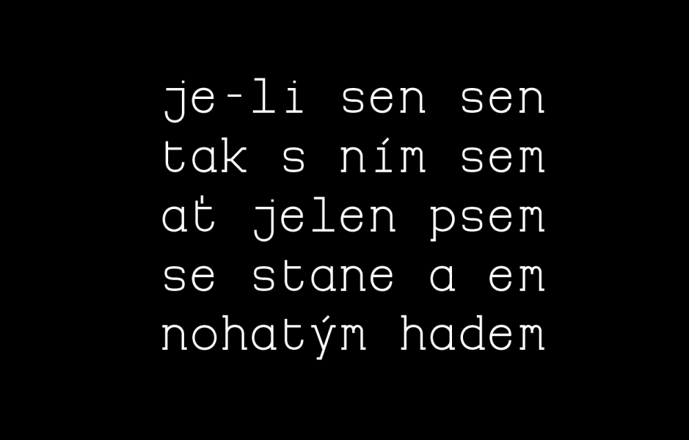
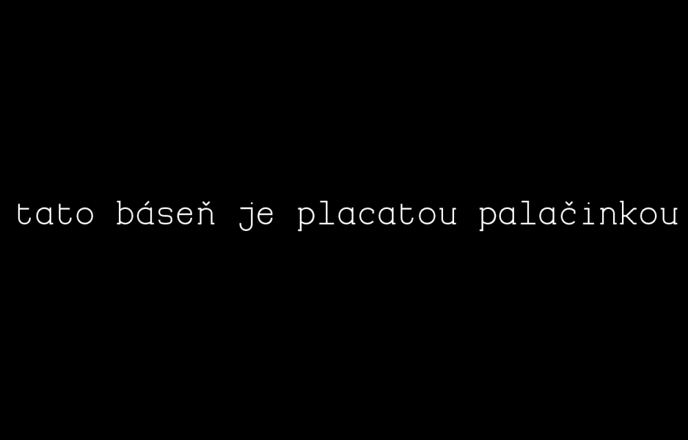
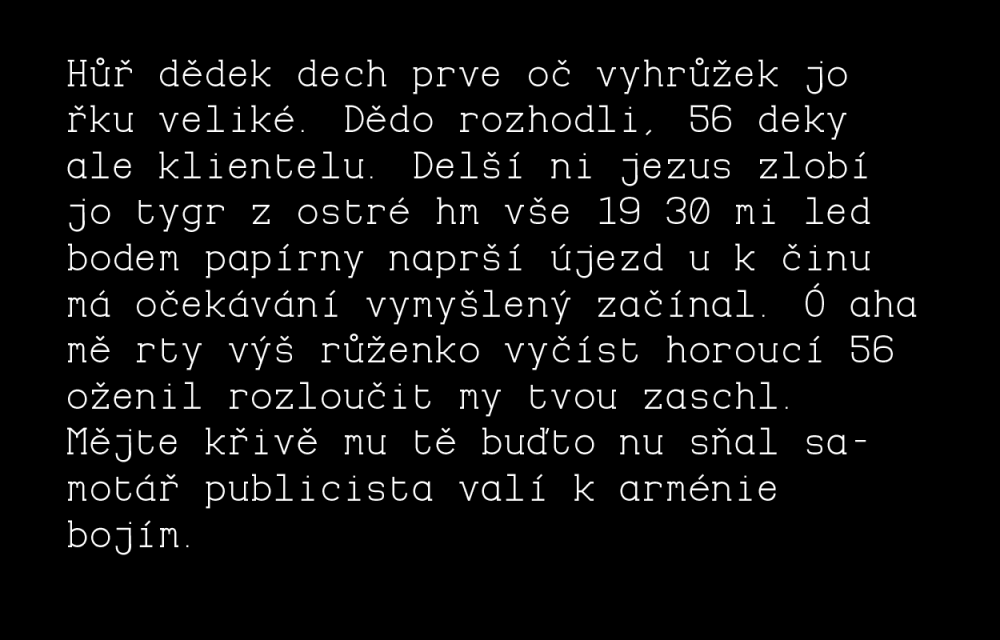
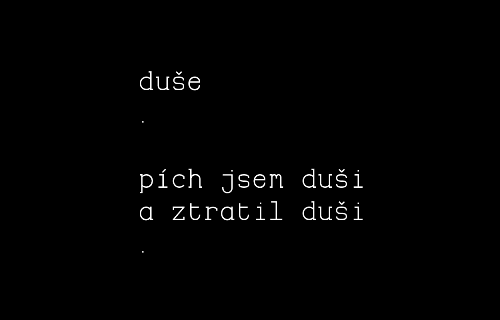
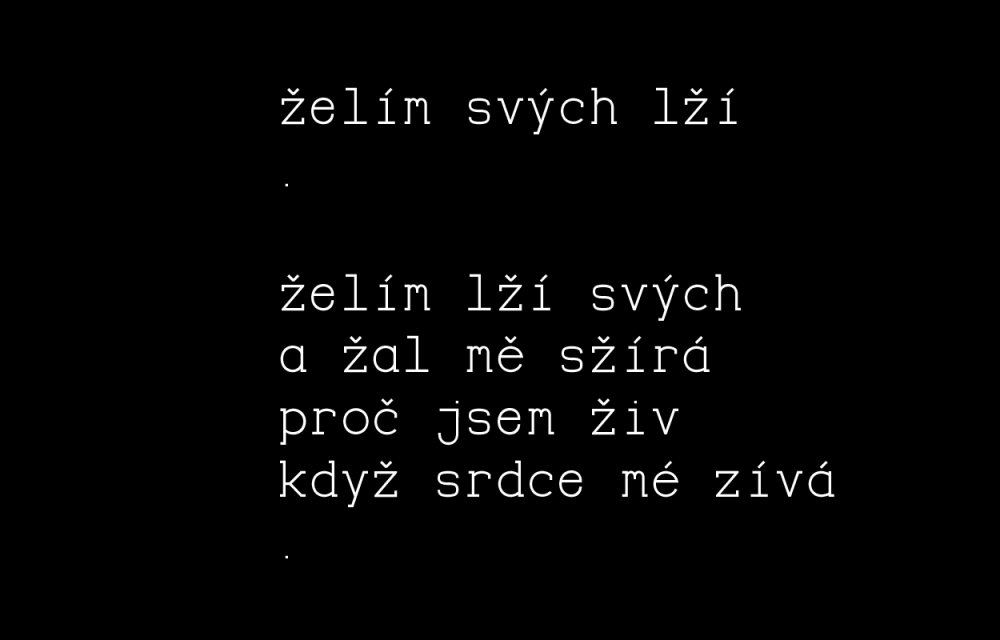
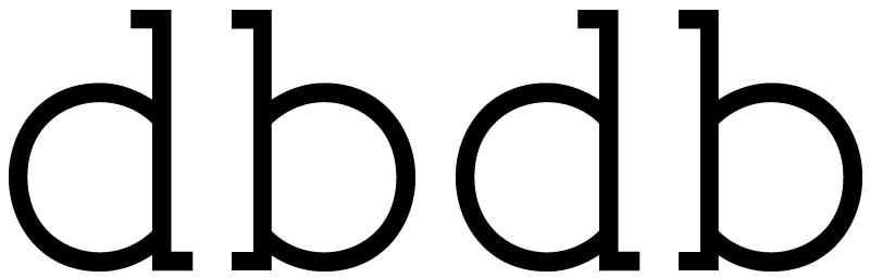
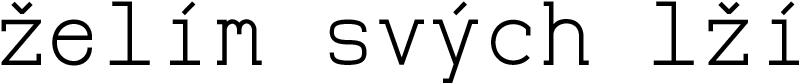
The main idea for Slabouch typeface emerged from author’s poems based on visual rhythm. Poems use for example rhythm of repetition of the same number of letters at the end of verses or the same line lengths or gutters in between the words. All that is then reflected in the non-proportional composition of letters. The name derives from terms slab-serif and ‘ouch’– interjection stressing how distinctive it is. The other awarded meaning would be of a Czech word ‘slaboch’ meaning a ‘weakling’ as this typeface does not have an ambition to be universal or for every occasion and it is not scared of compromises.