Kido
Designed by Jakub Valach in 2016
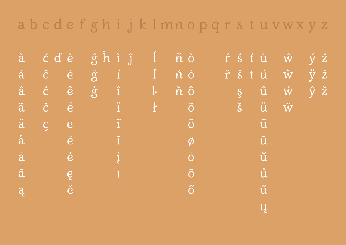
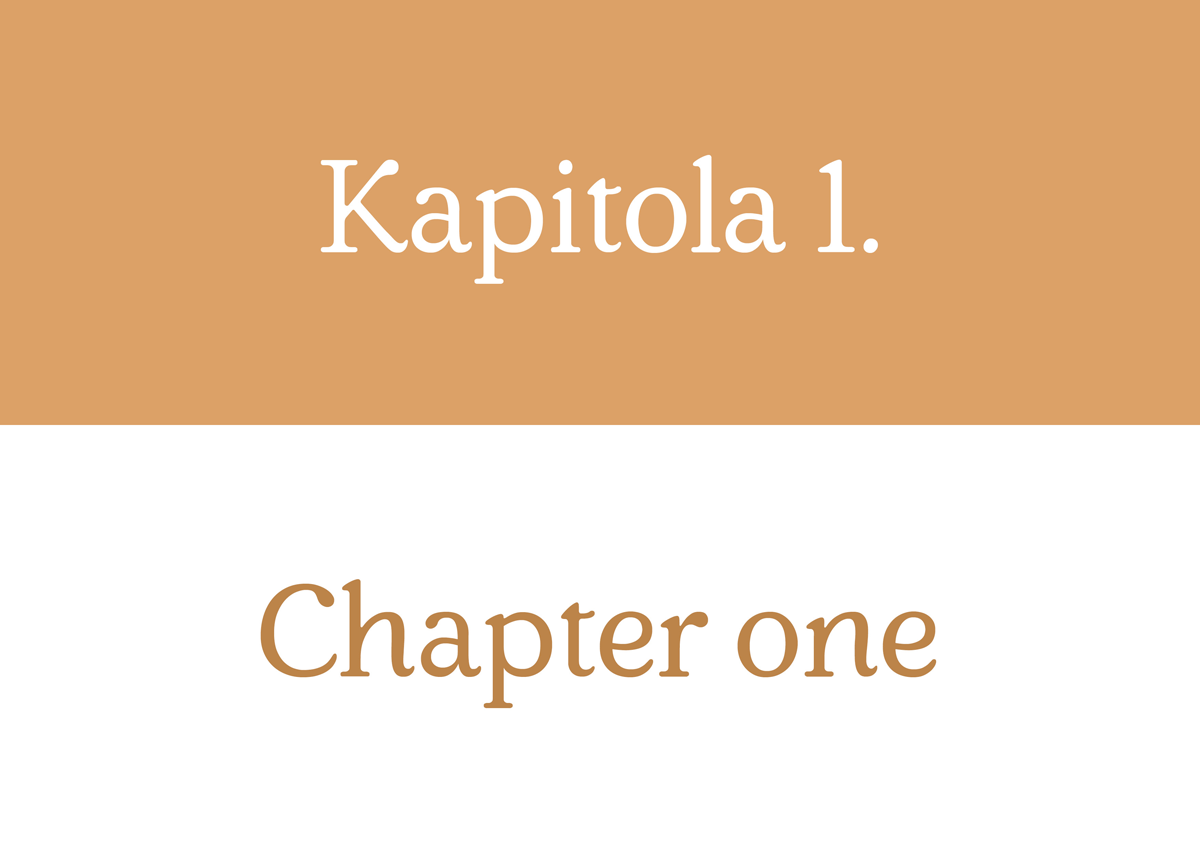
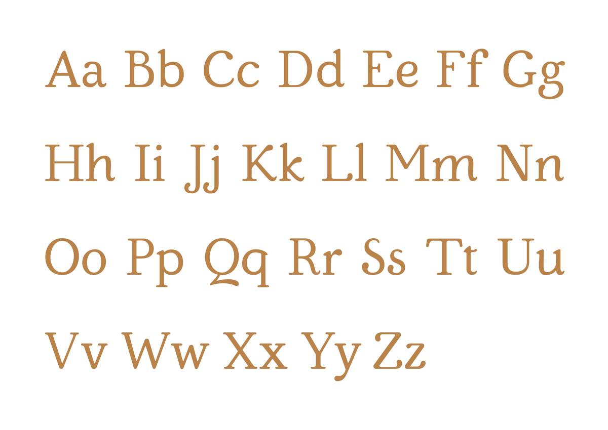
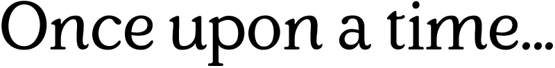
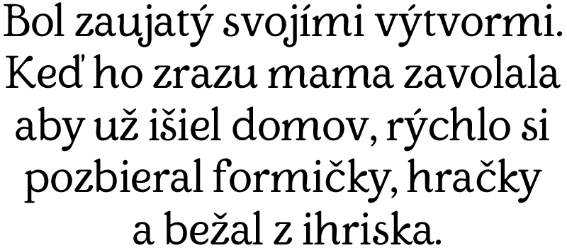
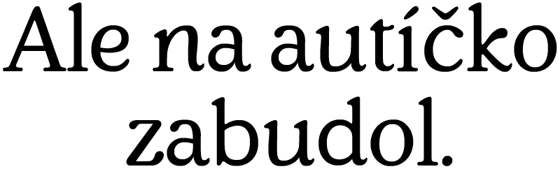
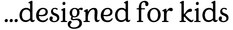
Typeface Kido, as its name already implies, is designed for the child reader. Originally it was designed for the children book, employing very subtle playfulness. That is the reason why there are details in shape and ends of strokes are not typical for Antiqua. Even with these creative elements the typeface retains its legibility thank to higher x-height in longer texts but can be used for headings as well.